CFB Fan Check-In
Research and Visual Direction
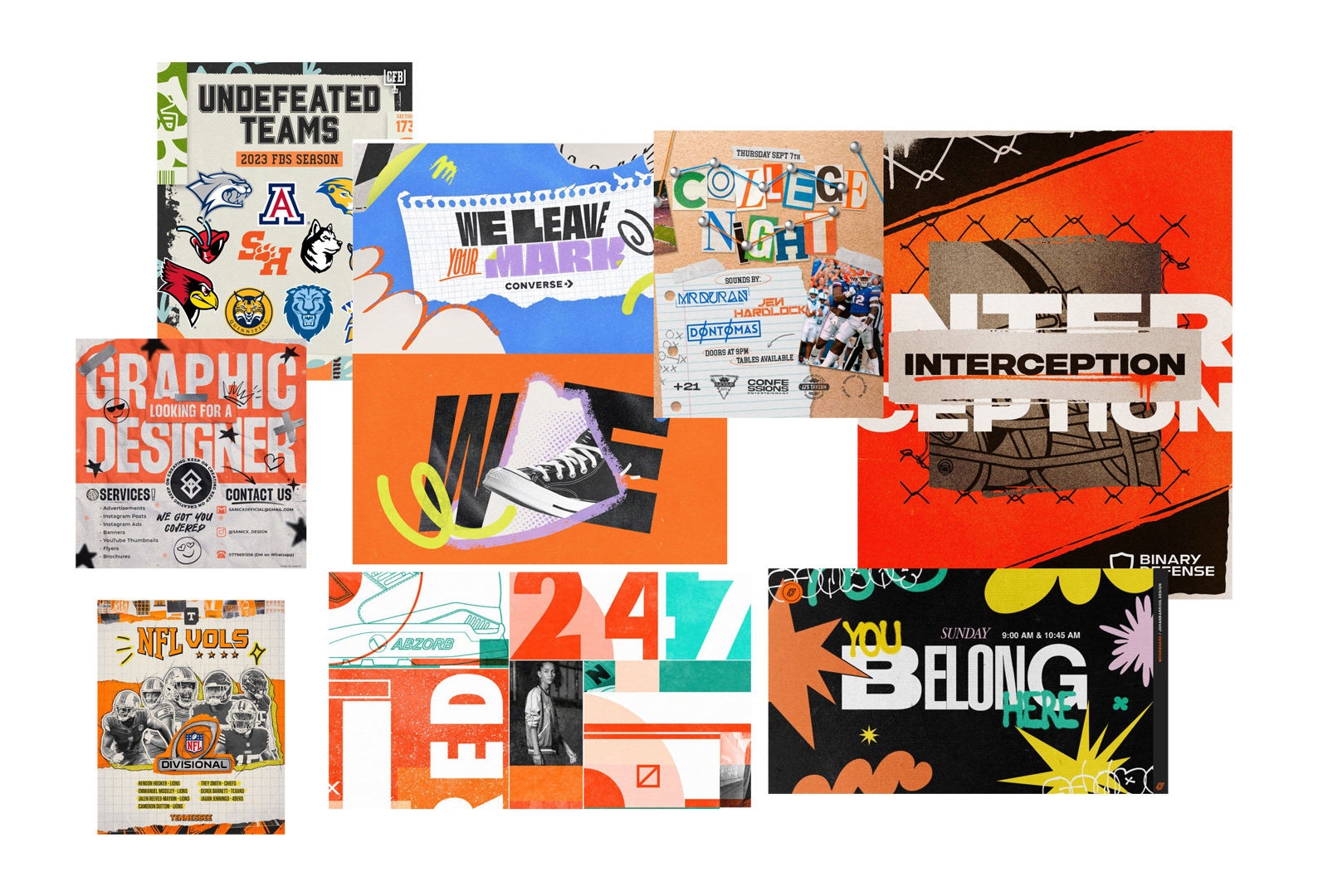
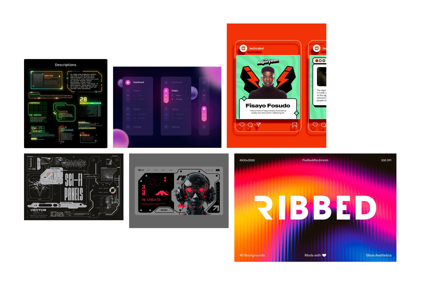
I explored two visual directions during the initial research phase, looking at editorial graphics, playful sports imagery, digital interfaces, typography, and visual systems that could translate to the CFB Fan Check-In experience.
Visual Exploration
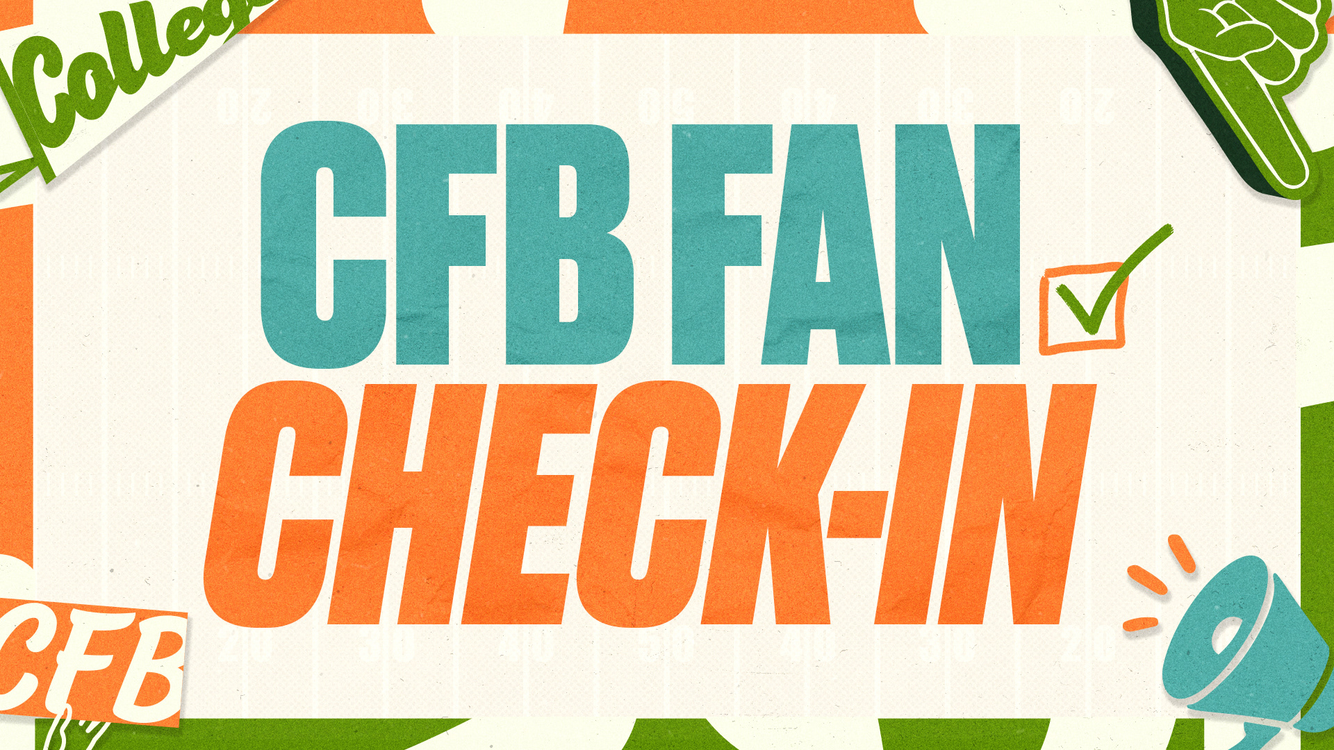
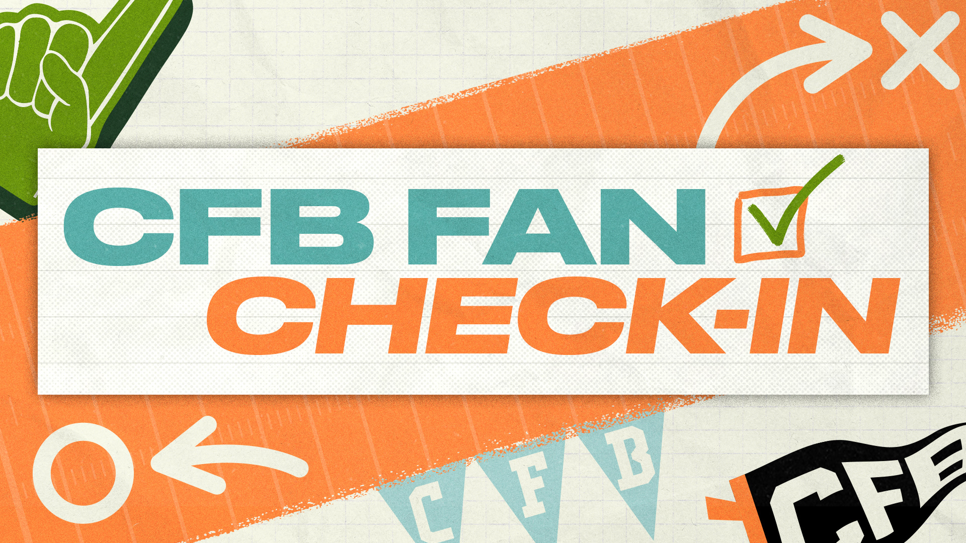
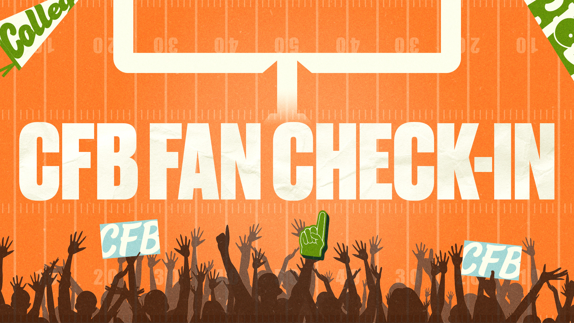
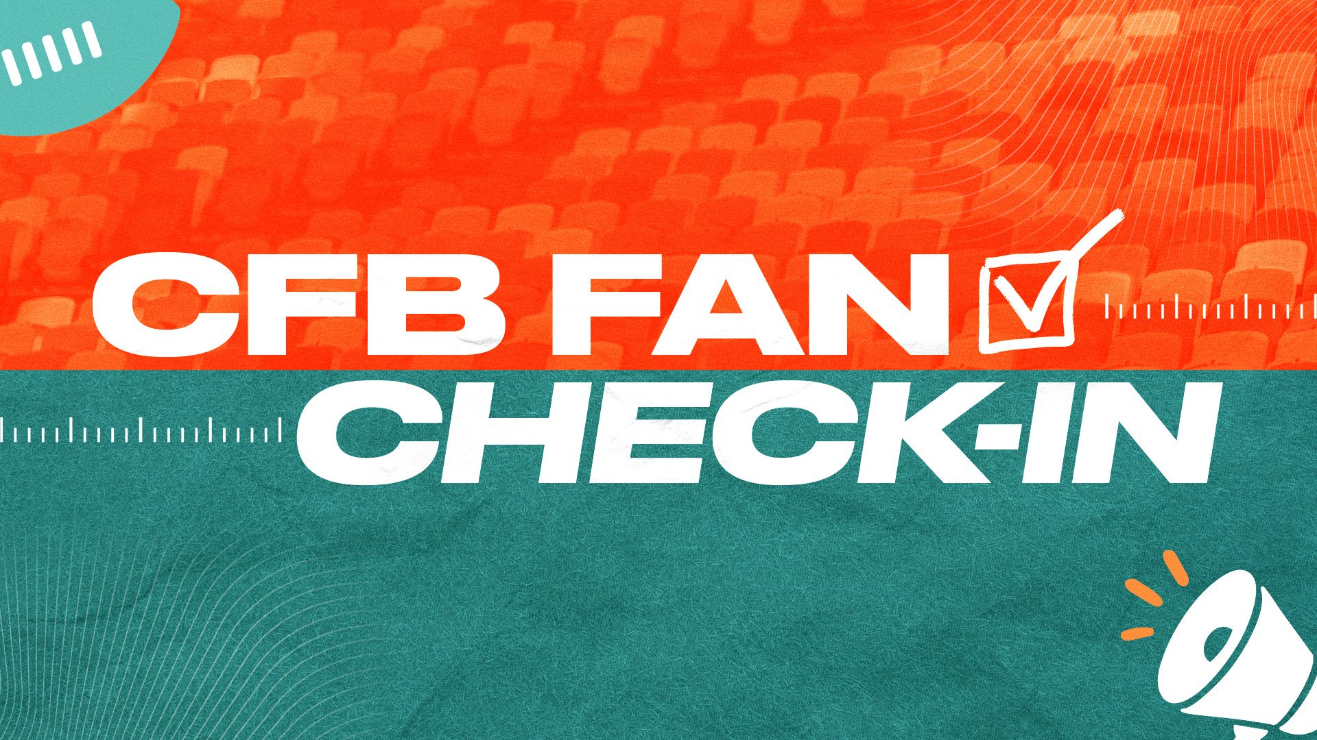
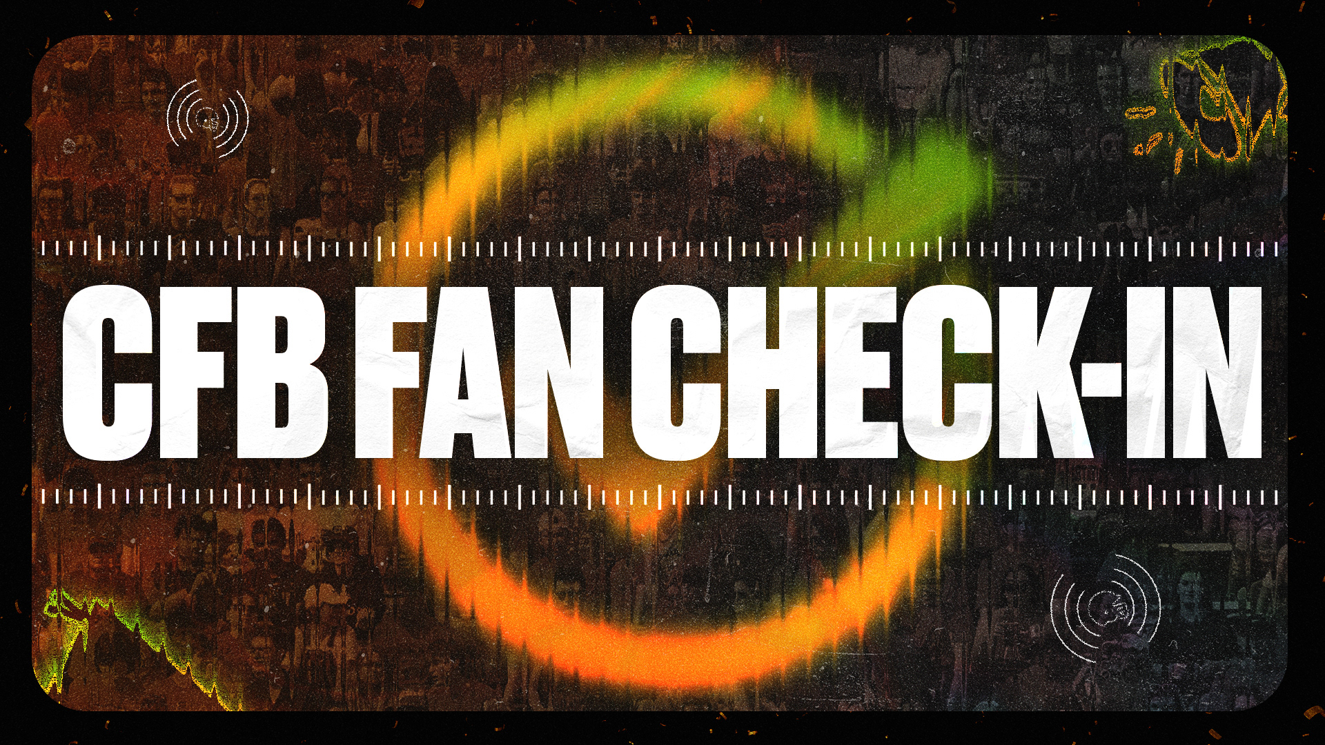
I explored a range of compositions, color treatments, typography, and graphic elements to determine how the identity could work within the app experience. The directions ranged from light and editorial to darker, more energetic treatments.
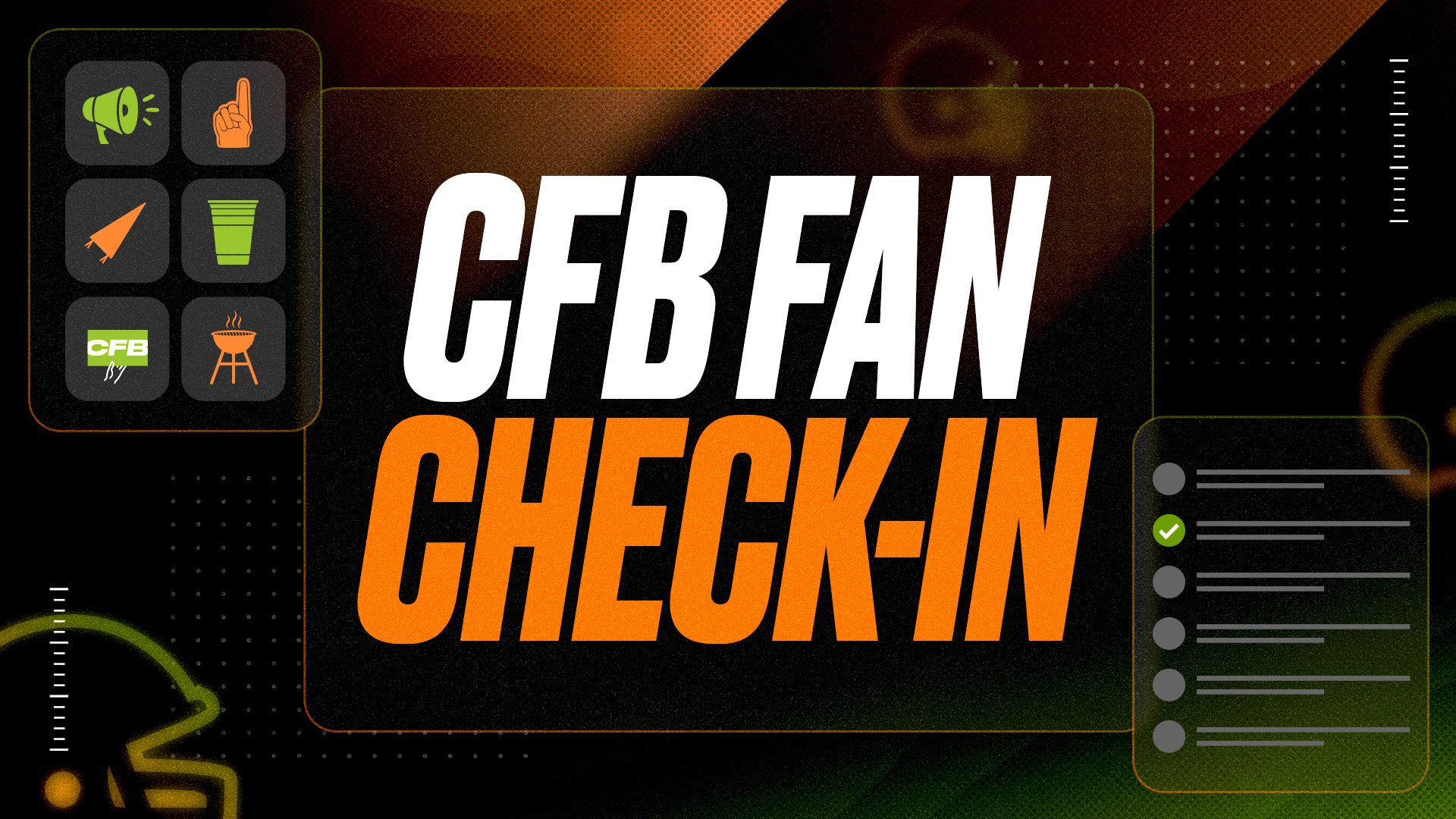
Refinement
From the initial explorations, I narrowed the direction toward a bold visual system with oversized typography, textured backgrounds, and green and orange accents. These iterations focused on refining the composition and establishing a more consistent visual language.
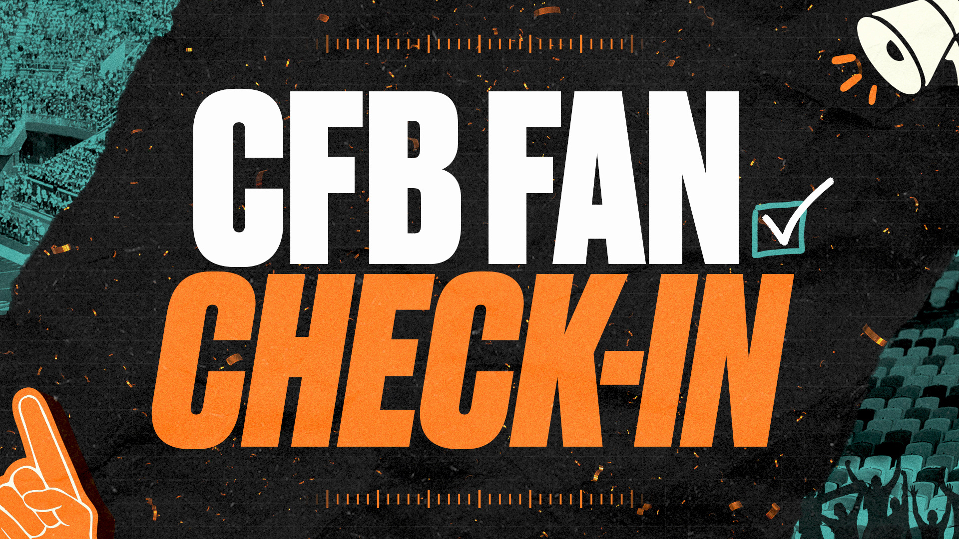
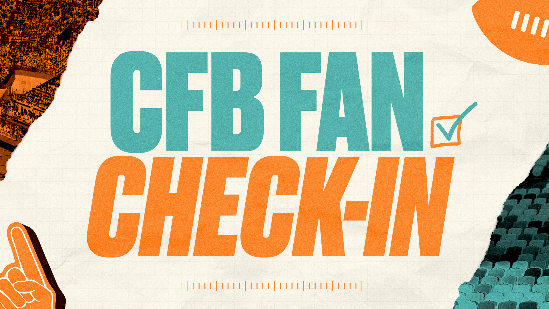
Final
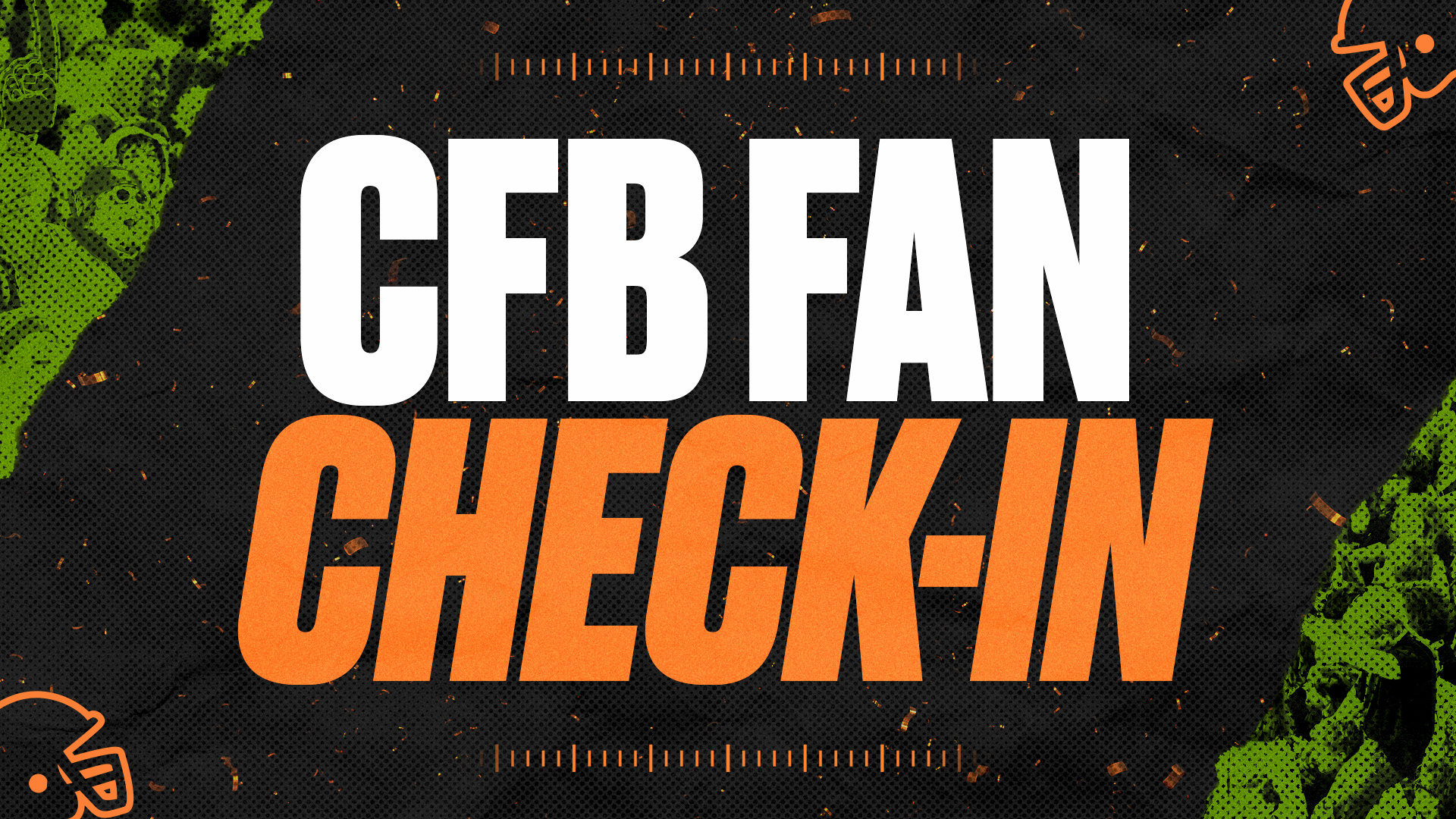
The final direction combines bold typography, textured fan imagery, football-inspired graphic elements, and confetti to capture the excitement of game day and the celebration of a team winning.